Explanation
오늘은 다시 찾아온 주말을 맞이하여, 요즘 적고있는 안드로이드 시리즈 제 4탄! 바텀시트 만들기 입니다!
모든 코드는 지난 코드를 기반으로 추가되어서 헷갈리는 부분이 있다면 지난글을 봐주시면 좋을 것 같아요.
3탄: (/fe-개발자를-위한-안드로이드-후려치기-3-자바스크립트/)
2탄: (/fe-개발자를-위한-안드로이드-후려치기-2-자바스크립트/)
1탄: (/fe-개발자를-위한-안드로이드-후려치기-1-웹뷰-만들기/)
작성된 코드는 https://github.com/falsy/blog-post-example/tree/master/android-for-frontend/bottom-sheet/android 에서 확인하실 수 있습니다!
1. 바텀시트 레이아웃(xml) 만들기
<!-- res/lauout/fragment_bottomsheet.xml -->
<?xml version="1.0" encoding="utf-8"?>
<androidx.constraintlayout.widget.ConstraintLayout xmlns:android="http://schemas.android.com/apk/res/android"
    xmlns:app="http://schemas.android.com/apk/res-auto"
    android:layout_width="match_parent"
    android:layout_height="match_parent"
    app:layout_behavior="com.google.android.material.bottomsheet.BottomSheetBehavior">

    <TextView
        android:id="@+id/textView"
        android:layout_width="match_parent"
        android:layout_height="400dp"
        android:gravity="center"
        android:text="Hello World"
        android:textSize="18sp"
        app:layout_constraintBottom_toBottomOf="parent"
        app:layout_constraintEnd_toEndOf="parent"
        app:layout_constraintHorizontal_bias="0.0"
        app:layout_constraintStart_toStartOf="parent"
        app:layout_constraintTop_toTopOf="parent"
        app:layout_constraintVertical_bias="0.5" />

</androidx.constraintlayout.widget.ConstraintLayout>
layout_behavior 속성을 'com.google.android.material.bottomsheet.BottomSheetBehavior'로 선언해 주었어요! 그리고 간단하게 텍스트 뷰를 하나 넣어줬어요. height는 400dp에 gravity를 center로 주어서 가운데 위치하게 하였습니다!
2. 메인 액티비티 레이아웃(xml) 수정하기
<!-- res/lauout/fragment_bottomsheet.xml -->
<?xml version="1.0" encoding="utf-8"?>
<androidx.constraintlayout.widget.ConstraintLayout xmlns:android="http://schemas.android.com/apk/res/android"
    xmlns:app="http://schemas.android.com/apk/res-auto"
    xmlns:tools="http://schemas.android.com/tools"
    android:layout_width="match_parent"
    android:layout_height="match_parent"
    tools:context=".MainActivity">

    <Button
        android:id="@+id/button"
        android:layout_width="wrap_content"
        android:layout_height="wrap_content"
        android:text="open bottom sheet"
        app:layout_constraintBottom_toBottomOf="parent"
        app:layout_constraintEnd_toEndOf="parent"
        app:layout_constraintHorizontal_bias="0.5"
        app:layout_constraintStart_toStartOf="parent"
        app:layout_constraintTop_toTopOf="parent"
        app:layout_constraintVertical_bias="0.5" />

</androidx.constraintlayout.widget.ConstraintLayout>
이전 글들의 메인 xml하고 거의 같아요!
3. 메인 액티비티에 바텀시트 프래그먼트 추가하기
// java/com.example.frontend/MainActivity
package com.example.frontend

import androidx.appcompat.app.AppCompatActivity
import android.os.Bundle
import android.view.LayoutInflater
import android.view.View
import android.view.ViewGroup
import android.widget.Button
import com.google.android.material.bottomsheet.BottomSheetDialogFragment

class ModalBottomSheet : BottomSheetDialogFragment() {

    override fun onCreateView(
        inflater: LayoutInflater,
        container: ViewGroup?,
        savedInstanceState: Bundle?
    ): View? {

        val view: View = inflater.inflate(R.layout.fragment_bottomsheet, container, false)
        return view
    }
}

class MainActivity : AppCompatActivity() {
    override fun onCreate(savedInstanceState: Bundle?) {
        super.onCreate(savedInstanceState)
        setContentView(R.layout.activity_main)

        val button: Button = findViewById(R.id.button)
        val modalBottomSheet = ModalBottomSheet()

        button.setOnClickListener {
            modalBottomSheet.show(supportFragmentManager, "Open Bottom Sheet")
        }
    }
}
딱 봐도 코드가 엄청 간단하죠!
ModalBottomSheet 라는 프래그먼트를 만들어주고, 버튼에 클릭이벤트를 추가해서 실행시켜주었어요.
여기서 inflater는 xml로 정의된 View를 실제 객체화 시켜주는 거라고 해요!
참고: https://dev-cini.tistory.com/29
끝
이라고 하기엔 내용이 너무 적어서.. 바텀시트에 줄수 있는 몇가지 옵션에 대해 적어볼게요!
우선 테마 스타일을 적용하고 수정해줄게요.
5. 바텀시트 옵션
우선 스타일 테마의 스타일을 주어볼게요.
<!-- res/lauout/values/themes.xml -->
<resources xmlns:tools="http://schemas.android.com/tools">
    <!-- Base application theme. -->
    <style name="Theme.Frontend" parent="Theme.MaterialComponents.DayNight.NoActionBar">
        <!-- Primary brand color. -->
        <item name="colorPrimary">@color/purple_500</item>
        <item name="colorPrimaryVariant">@color/purple_700</item>
        <item name="colorOnPrimary">@color/white</item>
        <!-- Secondary brand color. -->
        <item name="colorSecondary">@color/teal_200</item>
        <item name="colorSecondaryVariant">@color/teal_700</item>
        <item name="colorOnSecondary">@color/black</item>
        <!-- Status bar color. -->
        <item name="android:statusBarColor">?attr/colorPrimaryVariant</item>
        <!-- Customize your theme here. -->
        <item name="bottomSheetDialogTheme">@style/ModalBottomSheetDialog</item>
    </style>

    <style name="ModalBottomSheetDialog" parent="ThemeOverlay.MaterialComponents.DayNight.BottomSheetDialog">
        <item name="bottomSheetStyle">@style/ModalBottomSheet</item>
    </style>

    <style name="ModalBottomSheet" parent="Widget.MaterialComponents.BottomSheet.Modal">
        <item name="behavior_peekHeight">100dp</item>
        <item name="behavior_halfExpandedRatio">0.4</item>
        <item name="behavior_fitToContents">false</item>
    </style>
</resources>
간단하게, 테마 이름을 정해주고 'Theme.Frontend' 부모 태마를 'Theme.MaterialComponents.DayNight.NoActionBar'로 정해줬어요.
<!-- res/lauout/values/themes.xml -->
<resources xmlns:tools="http://schemas.android.com/tools">
  <style name="Theme.Frontend" parent="Theme.MaterialComponents.DayNight.NoActionBar">
    <!-- Customize your theme here. -->
    <item name="bottomSheetDialogTheme">@style/ModalBottomSheetDialog</item>
  </style>

  ...

  <style name="ModalBottomSheetDialog" parent="ThemeOverlay.MaterialComponents.DayNight.BottomSheetDialog">
      <item name="bottomSheetStyle">@style/ModalBottomSheet</item>
  </style>

  <style name="ModalBottomSheet" parent="Widget.MaterialComponents.BottomSheet.Modal">
      <item name="behavior_peekHeight">100dp</item>
      <item name="behavior_halfExpandedRatio">0.4</item>
      <item name="behavior_fitToContents">false</item>
  </style>
</resources>
대략 'bottomSheetDialogTheme > ModalBottomSheetDialog > ModalBottomSheet' 순서로 이어져있죠??
'ModalBottomSheet'의 세부 스타일에 대해서는 이따가 한번에 이야기할게요.
6. 테마 스타일 적용하기
이제 매니페스트에서 테마를 수정해줄게요.
<!-- AndroidManifest.xml -->
<?xml version="1.0" encoding="utf-8"?>
<manifest xmlns:android="http://schemas.android.com/apk/res/android"
    xmlns:tools="http://schemas.android.com/tools">

    <application
        android:allowBackup="true"
        android:dataExtractionRules="@xml/data_extraction_rules"
        android:fullBackupContent="@xml/backup_rules"
        android:icon="@mipmap/ic_launcher"
        android:label="@string/app_name"
        android:roundIcon="@mipmap/ic_launcher_round"
        android:supportsRtl="true"
        android:theme="@style/Theme.Frontend"
        tools:targetApi="31">
        <activity
            android:name=".MainActivity"
            android:exported="true">
            <intent-filter>
                <action android:name="android.intent.action.MAIN" />

                <category android:name="android.intent.category.LAUNCHER" />
            </intent-filter>

            <meta-data
                android:name="android.app.lib_name"
                android:value="" />
        </activity>
    </application>

</manifest>
여기에서 바로 요부분 입니다.
<!-- AndroidManifest.xml -->
<application
    android:theme="@style/Theme.Frontend"
    ...>
    ...
  </application>
짜잔 이렇게 선언해주면 이제, 'Theme.MaterialComponents.DayNight.NoActionBar' 테마를 기반으로 하는 '@style/Theme.Frontend' 스타일이 적용이 되었어요.
7. 바텀시트 스타일
이제 마지막으로, 아까 이야기 하려다 말았던 바텀시트 스타일에 대해 적어볼게요.
<!-- res/lauout/values/themes.xml -->
<style name="ModalBottomSheet" parent="Widget.MaterialComponents.BottomSheet.Modal">
    <item name="behavior_peekHeight">100dp</item>
    <item name="behavior_halfExpandedRatio">0.4</item>
    <item name="behavior_fitToContents">false</item>
</style>
'behavior_peekHeight': 뷰가 접힌 상태의 높이 값입니다. 음.. 제가 적은 샘플에서는 조금 헷갈릴 수도 있는데, 저는 버튼을 클릭했을때 바텀싯이 활성화 되도록 했으니까. behavior_peekHeight 값이 초기 높이값? 정도로도 생각할 수 있을 거 같아요.
'behavior_fitToContents': 기본값을 true이고 뷰 영역이 컨텐츠의 영역으로 정해지게 할지?! 정하는 설정으로 보여요. false로 설정하게 되면, 이후 설명할 'behavior_halfExpandedRatio' 에 설정한 값으로 중간 단계의 뷰 영역 단계를 가집니다.
(true로 설정할 경우 'behavior_halfExpandedRatio' 속성이 무시됩니다.)
'behavior_halfExpandedRatio': 앞서 설명한 'behavior_fitToContents'이 false 일때, 중간 단계의 뷰 높이값을 설정합니다. 기본값은 0.5로 화면의 절반입니다.
사실 몇가지 옵션이 더 있는데, 제가 다 써보지 못해서... 그 밖의 옵션들은 아래에서 확인 할 수 있어요~
https://developer.android.com/reference/com/google/android/material/bottomsheet/BottomSheetBehavior
8. 실행
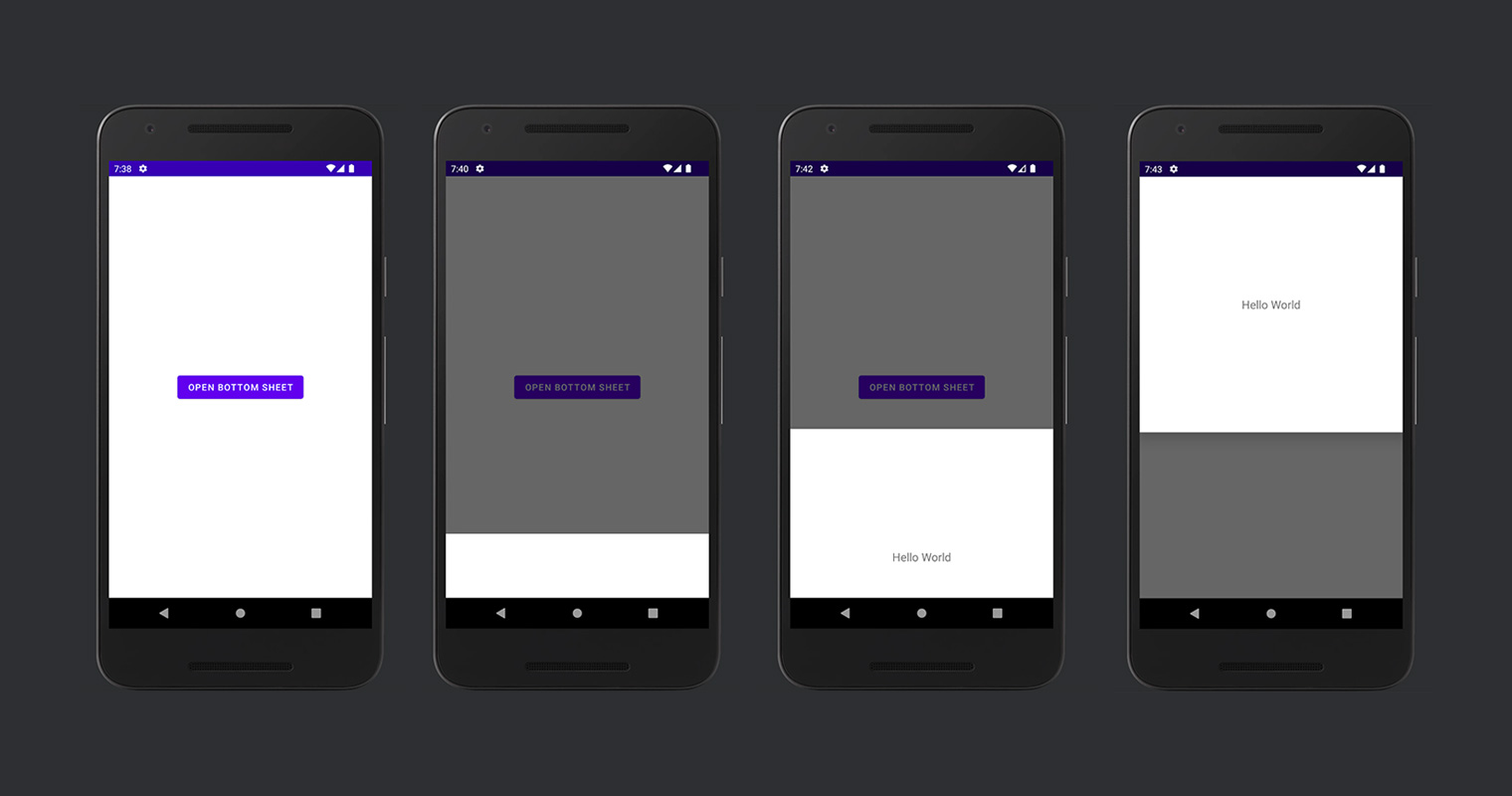
첫 번째가 실행한, 두 번째가 'behavior_peekHeight' 높이, 세 번째가 'behavior_halfExpandedRatio' 높이 마지막이 전체 화면으로 늘렸을 때입니다.